The Gallery
Category
Region
Country
School
Status
Order by Behance appreciations
Order by Submitted date
 Filter by Portfolio
All entries
Filter by Portfolio
All entries
 Filter by XD
All entries
Filter by XD
All entries
Entries found
Loading entries
The Doughnut Project Rebrand
Sydney Geller
Kent State University, United States
Commercial - Print / Graphic / Illustration
Category Semifinalist
Branding
The Doughnut Project: Rebrand
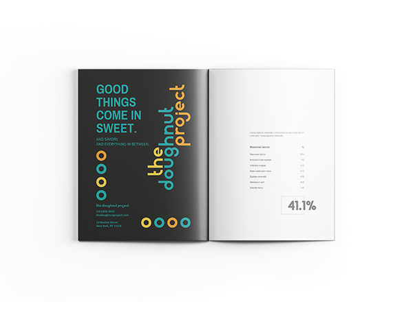
After much speculation, I found that while The Doughnut Project had insane doughnuts and a crazy shop, their existing branding didn't fully express the creativity put forth by their product. So, for my final project in my branding class I decided to create new branding guidelines for them. I began by creating a logotype where each letter is made mainly from circles, the basic shape of a doughnut. I also used bright, bold colors against a dark gray background to challenge the typical pastel colors put forth by other sweet shops. Building a cohesive social media platform was important as well, but I believed this shop could benefit from expanding into a food truck. This would allow the target market to grow while remaining a NYC staple.
This project was a Semifinalist in the 2018 Adobe Design Achievement Awards.
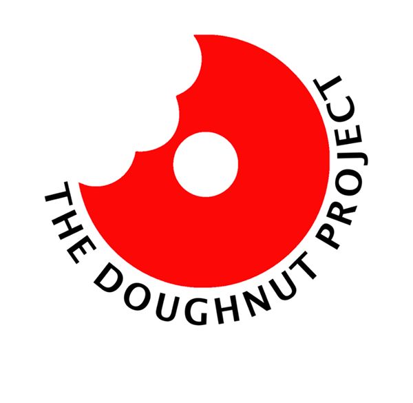

Before & After of The Doughnut Project Logo
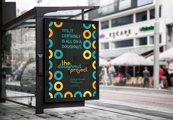
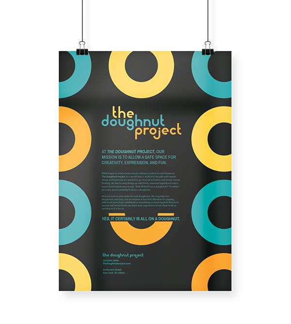

Advertising Mockups

Stationary Collateral
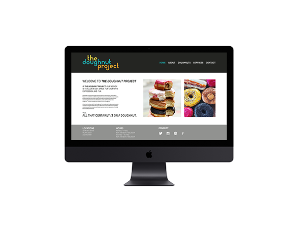
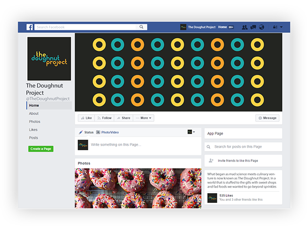

Web Prototype and Social Media
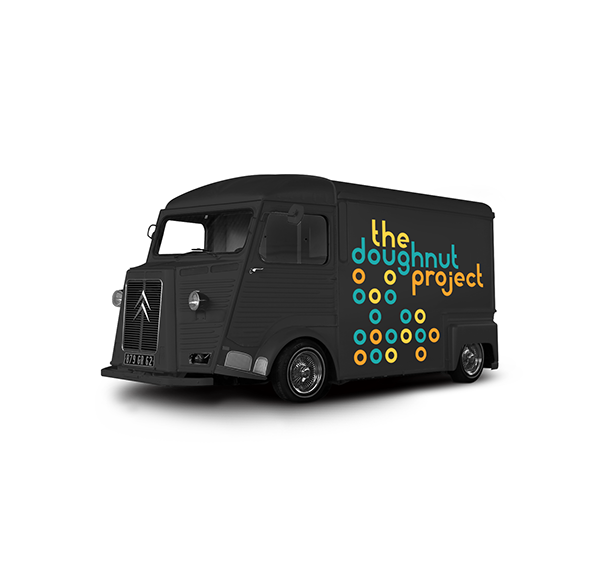
The Doughnut Project Truck
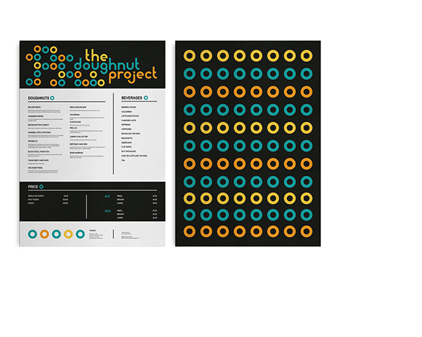
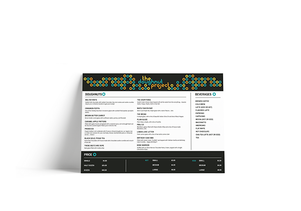
Hand-held Menu & Large Board Menu
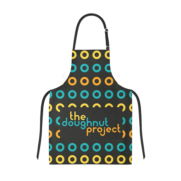

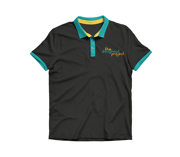
Uniform for In-Store and Food Truck