The Gallery
Category
Region
Country
School
Status
Order by Behance appreciations
Order by Submitted date
 Filter by Portfolio
All entries
Filter by Portfolio
All entries
 Filter by XD
All entries
Filter by XD
All entries
Entries found
Loading entries
589: Tell Me I am Fat
Scott Kim
Academy of Art University, United States
Fine Art - Graphic Design / Print
Category Honorable Mention
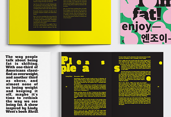
589: Tell Me I am Fat is a book is a book that expresses the tendencies of characters by using typography methods.
589: Tell Me I am Fat, 2016
Book Design for This American Life
Book Design for This American Life
Project Description
This design project started with the purpose of planning and studying typography and type settings through the observation of characters in the radio show. I decided the story of Lindy West who is working as a writer and a fat feminist in the United States as this project theme because her story that shared by Ira Glass through This American Life radio show was amazing and interesting. This project was to understand and plan a type system through the flow of stories, themes, and observation as a graphic designer that I said before. So, when I started this project I had to think a lot about the life of the fat people and their personality, and the ideal society they hope. And the biggest difficulty was how to show and talk about fat as a visual image because it can hurt the fat people who are alienated from society. But through Lindy’s story, I could see that being fat is just their appearance, and it does not mean the success or failure of something. Also, I was able to look directly this story, then I realized that the title of this 589th radio show was saying a lot of things about them. Therefore, as a graphic designer, I planned to express frankly about what they were and what their size with some humor and playfulness.
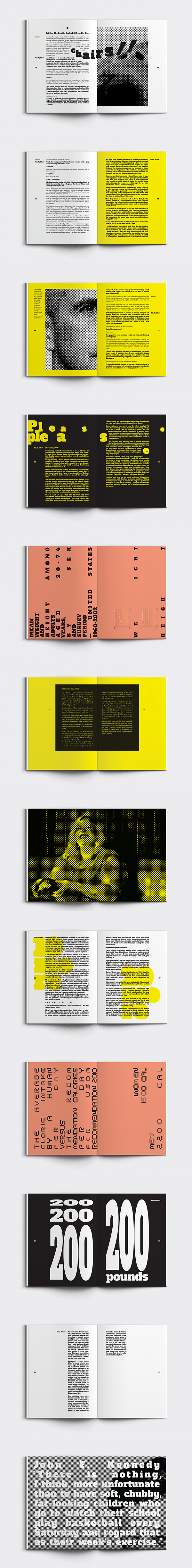
For the overall color of the project, I used yellow and black colors because these contesting colors were appropriate to express inside and outside and two aspects and to show the difference in perspective. Also for main typography, I used Alda slab serif and Myriad Pro fonts to show usual and unusual, and I thought it would be able to express the shape of people ’s body. In addition, I have sometimes used transformation grids, type systems, and the size of elements also to show the theme of the story and flow. And I boldly used all the images as halftones for the representation of their images, because the circle was the optimal graphical element for expressing fatness than the shape of the square or triangle. I also had thought that this effect would be much help to the visual language.
The goal of the design was to show the theme and concept through typography and type settings until the end of the book. And I think all the design elements and methods that appear in this book are connected through various formats, styles, color, typeface, and design philosophy although this book does not have much of a glamor or grandeur. I would like to say this book and project are cool because this book has been made very honest and pleasantly like to show everything honestly— and like the title of this book.
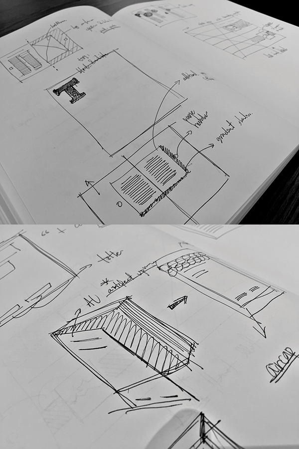
Process for document styles and graphic motif
Book Cover Digital printed / 5.5 X 8 inch / Wrap

Book Design Digital printed with perfect binding / 5.5 X 8 inch / 104 pages
Poster Design Digital printed / 11X17 inch

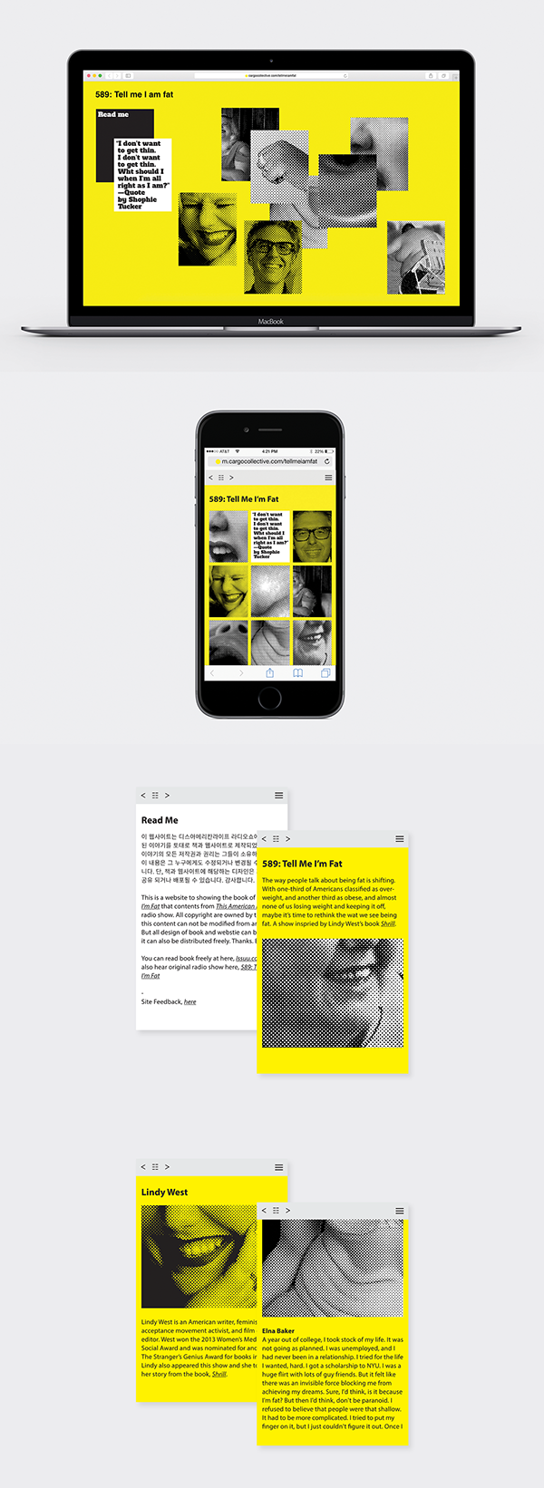
Web&Mobile Design Cargo Collective with customizing HTML5, CSS, and Javascript Here, link