The Gallery
Category
Region
Country
School
Status
Order by Behance appreciations
Order by Submitted date
 Filter by Portfolio
All entries
Filter by Portfolio
All entries
 Filter by XD
All entries
Filter by XD
All entries
Entries found
Loading entries
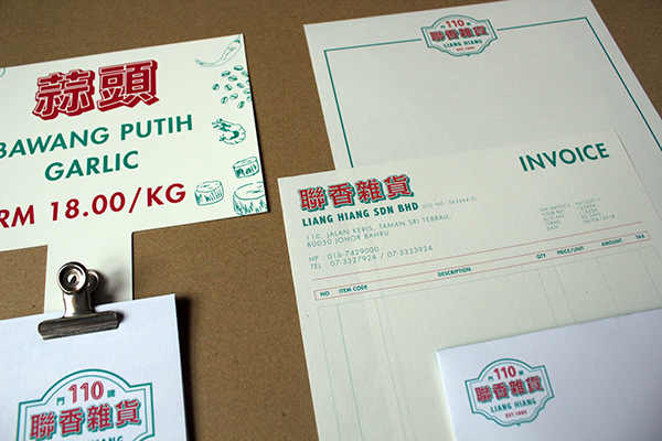
Liang Hiang 聯香雜貨
Jenny Teoh
Inti International Subang College , Malaysia
Commercial - Print / Graphic / Illustration
Category Semifinalist, APAC Honorable Mention
This project is about rebranding a local chinese groceries store. Liang Hiang Sdn Bhd has been more than 30 years and they seeking to break out of the already intense local competition and to provide customers a new sense of retail atmosphere and experiences.


This project is about rebranding a local chinese groceries store.
Liang Hiang Sdn Bhd has been more than 30 years and they seeking to break out of the already intense local competition and to provide customers a new sense of retail atmosphere and experiences.
Therefore, they wish to have a new identity and also a contrasting balance of vintage and modernity, where it will not only maintain or increase appeal amongst the existing elderly market but also attract a younger group of customers.
To infuse the brand with modern and nostalgic elements, green colour has been chosen to be the primary colour for this project. Besides, to retain some of the old flavors of the brand whilst the hint of modernity and this project using risograph printing to complete the branding.


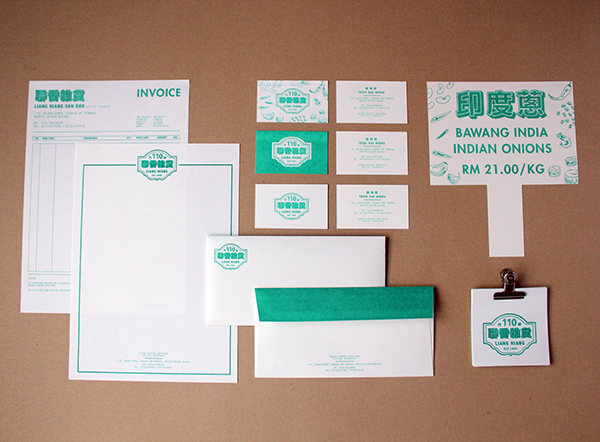


Here is the digital printing effect.