The Gallery
Category
Region
Country
School
Status
Order by Behance appreciations
Order by Submitted date
 Filter by Portfolio
All entries
Filter by Portfolio
All entries
 Filter by XD
All entries
Filter by XD
All entries
Entries found
Loading entries
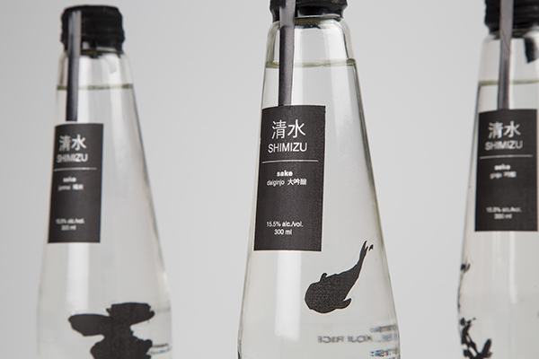
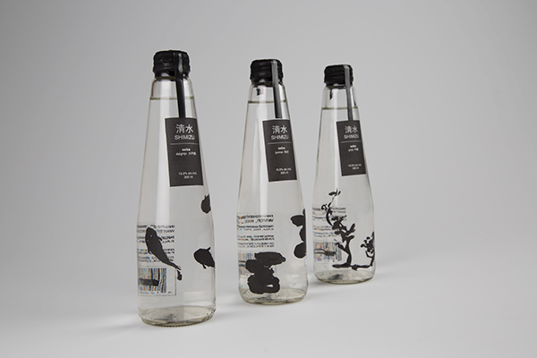
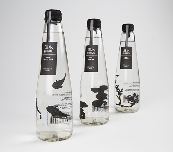
Shimizu Sake
Michelle Z
OCAD University, Canada
Commercial - Packaging Design
Category Semifinalist

清水
Shimizu
(shi) meaning “clear, pure, clean” and (mizu) meaning “water”
Shimizu is a conceptual brand of sake from a local Canadian brewery. Many types of sake are extremely difficult to find in the average liqueur store due to importing. There has been a few Canadian sake breweries created within recent years due to demand and the sake brewed are often available in general liqueur stores. The sake that is more accessible in foreign countries often has packaging that does not relate well with more Western audiences due to the overabundance of Japanese characters.
Shimizu sake uses a cleaner design for the packaging and it targets a younger demographic (20-35 yr). The use of only black emphasizes the quality of the alcohol while also minimizing printing and production costs.