The Gallery
Category
Region
Country
School
Status
Order by Behance appreciations
Order by Submitted date
 Filter by Portfolio
All entries
Filter by Portfolio
All entries
 Filter by XD
All entries
Filter by XD
All entries
Entries found
Loading entries
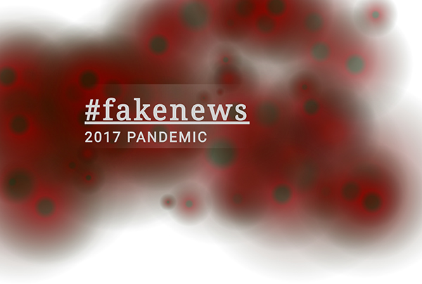
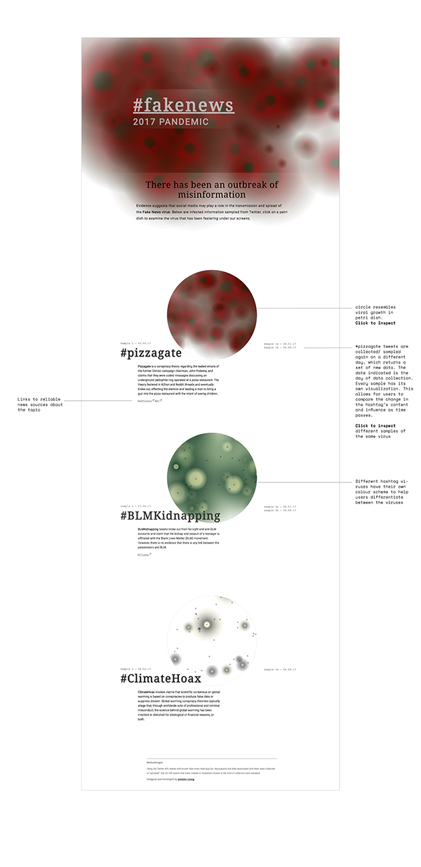
#fakenews 2017 Pandemic
Jasmine Leung
Ontario College of Art and Design University, Canada
Social Impact - Web / App / Game Design
Category Semifinalist
#Fakenews 2017 pandemic is a project developed as part of my undergraduate thesis about technology driven fears and anxieties. The interactive project examines the recent outbreak of misinformation in social media and allows viewers to inspect the spread of fake news viruses.
CONCEPT
Advancements in Ad-targeted Algorithms and our demand for more personalized digital experiences guide our exploration of the web. This cherry picking and filtering of information has led to the polarization of ideas, creating filter bubbles and the perfect sheltered environment for incubating biased and misleading information. The recent United States election has brought to the surface this problem that has been festering under the surfaces of our screens. #fakenews 2017 Pandemic draws parallel between the spread of a virus and the spread of misinformation. With this visualization, I aim to analyze fake news content and its dispersion and influence.
RESEARCH AND INSPIRATION
I was inspired by Guillaume Chaslot’s studies and mappings of Youtube's suggested videos to visualize Algorithmic bias and filter bubbles during the elections. In a similar fashion, I wanted to visualize the spread of fake news articles in social media. To start, I had a few issues to resolve: how could I accurately map the sharing of a fake news story, how would I identify a fake news post, where would I get this data and what story are people suppose to draw from this visualization?
To even begin my exploration, I would need a mass source of fake news data. I was unable to find any robust data online, and because of my lack of technical skills, I was unable to crawl my own. I had to narrow my scope. I came upon The Influentials: New Approaches for Analyzing Influence on Twitter, which measures twitter influence as “the potential of an action of a user to initiate a further action by another user.” and defines an action as any interaction with a tweet. By this logic, a reply, mention or retweet is an indicator of a tweet’s influence on other users, which begs the question, how influential are fake news tweets in triggering further action on Twitter?
DATA COLLECTION
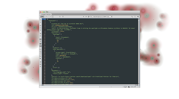
Using the Twitter API, I filtered and collected tweets that used hashtags associated with fake news and that also shared a link. Each Twitter query returns up to 100 tweets and their metadata published within the 7 days prior to the time of query.
PROCESS
Visualization Design
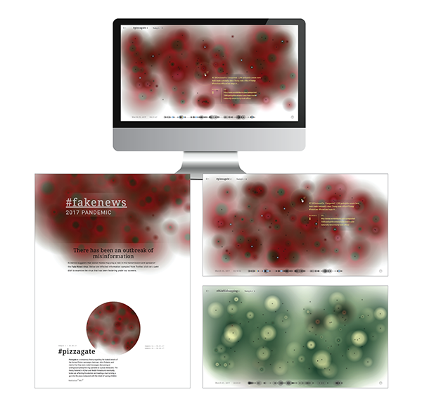
Two key pieces of information I needed to communicate were the tweet and its retweet count. I started by assigning each tweet to a circle, with the size of each circle representing its retweet count. The visual language of the circles needed to reflect the infectious nature of misinformation on social media, so I applied radial gradients to the circles to mimic bacterial or viral growth. The tweet circles were laid in a grid, and lined up by time created.
Since each circle is a different size, overlap is inevitable. Overlapping circles make mouse selection confusing for the browser and user. To solve this issue, I overlaid small circles at the centre of viruses. These small circles are less likely to overlap and function as interactive points to the viruses. Users are to hover over these points to access the tweet's metadata (E.g. content, retweet count and link.) Because of the grid layout, I felt the interaction points took away from the organic virus pattern, therefore I added a button to hide and show the interactive points. I shortly abandoned the grid layout in favour of a random one to mimic the organic growth of viruses.

Visual Language
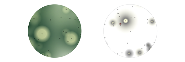
The main colour scheme is inspired by images of mould and bacteria growth on red agar. I used a dark green to maroon radial gradient with the intention that users would associate the combination of these colours with bacteria in a petri dish. The green centre was intended to help users pinpoint the centre of a cell without the presence of its interactive points. With all the viruses having the same outer colour (maroon), they blend into one another to create a harmonious cluster of cells. The fade out to transparency visually anticipates more growth, and is reminiscent of mould fuzz.
Besides the main colour scheme, other mould inspired colour schemes are also used to differentiate between fake news viruses.

In early iterations of design, the tweet's secondary information (content of the tweet, the date and time, and link attached) appeared on the top left corner. However, this split the user’s attention between the corner of the screen and the selected virus. I moved the tweet's information next to the virus so users could catch both primary and secondary information seamlessly. Within the tweet's information, I reorganized the information hierarchy, with the content of the tweet having priority, and the retweet number and url link as secondary information.
Another element of the visualization was time. The timeline provides a summary and secondary, structured understanding of the data compared to the chaotic clusters of viruses. Each dot on the timeline represents a tweet virus, they are placed sequentially from its time of creation and its radius communicates its retweet count. Hovering over a timeline dot highlights its corresponding virus above and triggers its tweet information to appear. This works both ways: when hovering over a virus’ centre, its corresponding dot and position on the timeline is also highlighted. The timeline allows users to compare the sizes of all the viruses, and allows for users to scrub through all the viruses at once.
Interface Feedback
To indicate that a user was interacting with a virus, the targeted virus would appear darker than others. The intent was to provide feedback to the user as well as highlight the size of the virus more clearly. This darkening of the virus caused its black interaction circle to blend in with the dark green centres. This hid the interaction point, and not seeing the interaction boundaries was a frustration. In the final iterations of the visualization, the solution I used was to highlight the interaction circle with the same yellow as the text. This solved two problems; users can now tell where the interaction boundaries were, and having the targeted centre and tweet info in the same yellow builds a visual link through colour association. Another issue was that the size of the virus was not as legible as I wanted it to be. The layering and the transparent edges of the viruses make the full size of the selected virus hard to see, even if it did turn darker upon selection. To clarify the size of the virus, I added a yellow dashed outline around the virus upon selection. It was just thick enough to be legible, yet not too intrusive.

External Links
I wanted users to be able to access the sources/links that these twitter users shared. In my initial design, the links opened on a new tab. However, this proved to be frustrating as users were completely removed from the environment and lost their spot in the visualization. The solution I used was to open the links in small pop up windows. The pop up window functionality has been hijacked by dodgy websites to display their “pop up ads.” It’s interesting to see how the use of this “annoying” functionality in the context of my project was quite fitting. Most of the links shared by these twitter users are quite questionable, and the use of the pop up windows reinforced that.
Figuring out how to communicate to users they could click the virus centres to open links was a difficulty. I decided to tackle this through a few fronts. Changing the cursor from the default to a pointer when hovering over a virus centre helped significantly. Most users have already learned the associations between the pointer and interactivity. I also added a subtle external link icon next to the virus centre when hovered over. The presence of the external link icon also helped in differentiating tweet viruses with attached links with those who did not (though I did filter my Twitter query to only tweets with links attached, there were still a few tweets that returned with no links).

Navigation
One change that had a major impact on the usability of the visualization was the removal of the “inspect” button, whose purpose was to hide and show the interactive centres. An ongoing issue was that users were unable to find the button, and therefore were lost on what to interact with (if the inspect button was not clicked, the interactive centres are not shown). After multiple user testings, it was clear that the “inspect” button was useless. Its purpose existed in the early stages of the visualization to hide the grid layout; the button had become a useless evolutionary trait after the adoption of the random layout of viruses. The inspect button was removed and the default setting was to always show interactive centres. This simplified user interaction and removed previous confusions.
With the navigation, I integrated a drop down menu to the visualization labels (#pizzagate, sample 1). This eliminated the need for sidebar menus and the navigation became more self-explanatory (E.g. #pizzagate is the label of the overall visualization, logically its dropdown menu would contain other labels - #BLMkidnapping and #Climate Hoax). A custom back button was added to prevent the visualization page from feeling like the user has hit a dead end and to encourage further exploration. An information button is also added in the corner of the screen in case further explanation is needed.

Landing page Design
The landing page is intended to set the stage and tone. To tie the idea of the spread of fake news on Twitter to the spread of a virus, I named the project “#fakenews 2017 Pandemic”. On the homepage, there is a small description of each hashtag to give context. A screenshot of each hashtag’s visualization is attached so users can have a quick glimpse of the data and its patterns; it also allows for quick visual comparisons between datasets. The images are enclosed within a circle to graphically resemble a petri dish. Each fake news hashtag have their own visualization page and are differentiated by their colour schemes. For #BLMKidnapping and #ClimateHoax, I used colour schemes inspired by different types of mould. Each fake news virus also contains different "samples". For example, #pizzagate tweets were continuously collected on several dates, each day returned an updated dataset because tweets are continuously being posted. Each of these datasets have their own visualization; this way users can compare the change in the hashtag's content and popularity at different times.
For more process click here