The Gallery
Category
Region
Country
School
Status
Order by Behance appreciations
Order by Submitted date
 Filter by Portfolio
All entries
Filter by Portfolio
All entries
 Filter by XD
All entries
Filter by XD
All entries
Entries found
Loading entries
Birds of Toronto: Species at Risk
Gurleen Hansi
York Sheridan Joint Program In Design, Canada
Social Impact - Photography / Print / Illustration / Graphic
Category Semifinalist
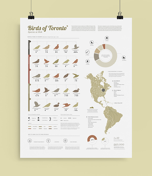
A visualization that aims to educate residents of Toronto about the increasing vulnerability of various bird species, including the primary causes of population decline and how to create a 'bird-friendly' environment.
Birds of Toronto: Species at Risk
Data Visualization
-----------------
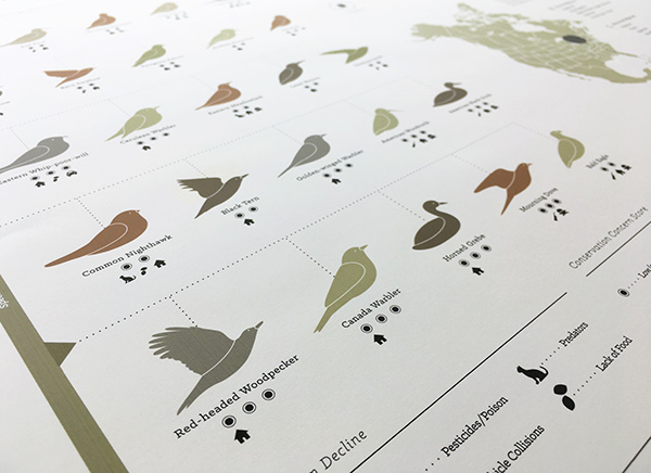
The city of Toronto is home to nearly 115 to 120 different bird species. Unfortunately, some of these populations have been declining due to human-related factors (i.e. building collisions, pesticide use, hunting, etc), and are now considered to be vulnerable. This visualization depicts the level of vulnerability of various bird species found throughout the city. Each type of bird is placed on a scale ranging from special concern (low risk) to threatened to endangered (high risk). The primary cause of population decline and overall Conservation Concern Score is also indicated below each bird illustration. Additionally, these birds have been colour coded according to their primary habitat in/around the city so that residents are able to identify which species are common in certain areas. Along with this, the circular graph on the right indicates the top five overall risks to birds in the city and the approximate number of deaths caused per year. The bottom section of this poster features preventative measures and tips on how to make the city more "bird-friendly" so that current populations can be sustained.
The purpose of this visualization is to educate residents and raise awareness regarding the impact that our actions have on birds and the overall environment of the city. Through this, the Toronto community will have a greater understanding of the severity of this issue and will be able to use the suggested tips in their daily life to create a safer space for our birds.


Concept Development & Preliminary Sketches
----------
After doing research on the birds of Toronto and the primary causes of population decline, I began brainstorming various modes of representation. When deciding on the focal point of my visualization, I experimented with various graphs and visual styles (shown below), but ultimately decided to use minimalistic illustrations of birds to represent the data for each species. By using an illustrative style of representation instead of traditional graphs, I felt that this visualization would be more interesting, engaging and easier to understand for everyone. Initially, this was a bit challenging for me as I have not had a lot of experience with digital illustration and icon creation. To achieve this, I experimented with the pen tools in Adobe Illustrator and was successful in creating stylized visuals of the birds and simplified icons. The final composition above combines statistical (charts/graphs), chronological (time-based) and relational (maps/networks) modes of data visualization in an illustrative style.

Colour Scheme / Visual Style
----------
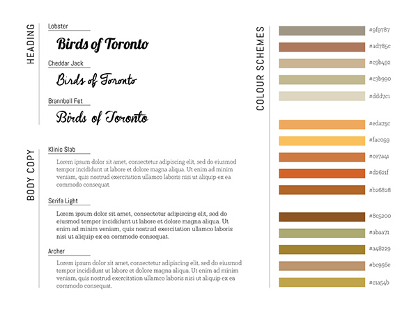
Various typefaces and colour schemes were explored in the process of creating a visual style for this infographic. The typeface I chose for the primary title is Lobster as it has a well-balanced flow and elegance that resembles the movement of birds, while the body copy is a combination of Klinic Slab and Serifa Light. Out of the three colour schemes below, I chose to use the first as its muted shades and earthy tones match the dominant colours of birds in Toronto.
Full process can be viewed here: