The Gallery
Category
Region
Country
School
Status
Order by Behance appreciations
Order by Submitted date
 Filter by Portfolio
All entries
Filter by Portfolio
All entries
 Filter by XD
All entries
Filter by XD
All entries
Entries found
Loading entries
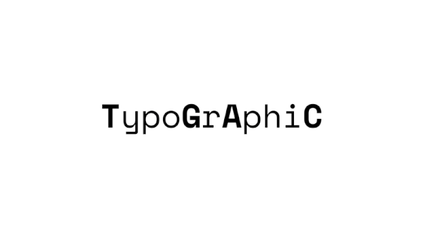
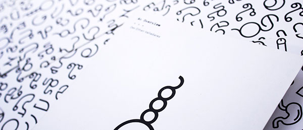
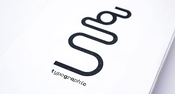
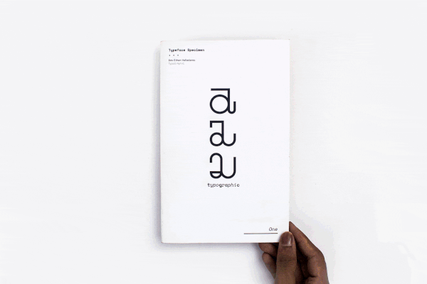
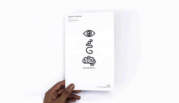
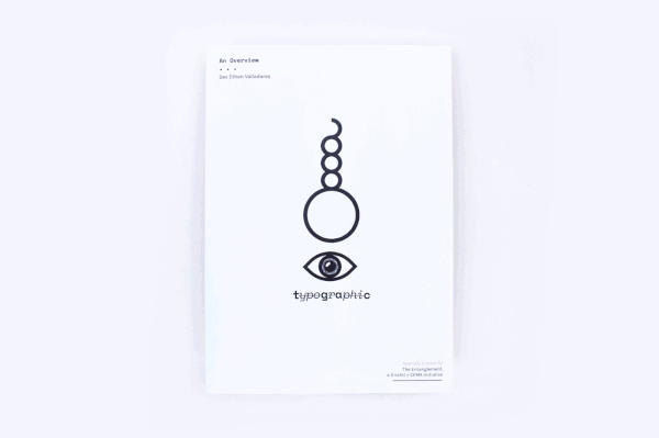
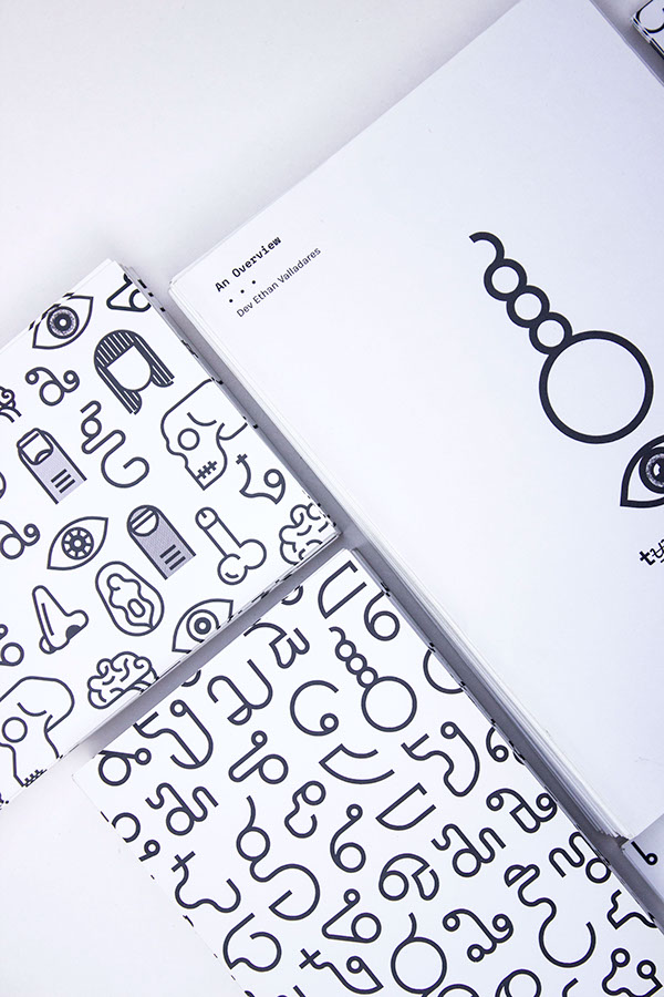
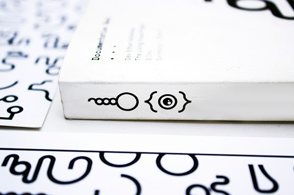
TypoGrAphiC
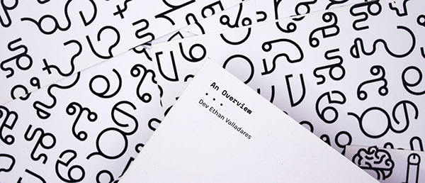
Dev Ethan Valladares
Srishti Institute of Art, Design & Technology, India
Fine Art - Graphic Design / Print
Category Winner
An intersection between Biology and Typography, TypoGrAphiC is a set of conceptual typefaces that explore and communicate various ideas of the genetic code and its manifestation into human life. It also does this using just 4 letters, the 4 bases in our DNA: an 'A', a 'C', a 'G' and a 'T'.

Why are we alive? What is our purpose? What makes each of us who we are, unique in our own way, and what makes us humans different from other lifeforms? Where did life itself first come from?
These were some of the questions I asked myself at the beginning of my pre-thesis project, in a course called ‘The Living Visual’ centred around Biology.
I began research and traced the answer from evolution through heredity to arrive at a molecule in each of our cells called deoxyribonucleic acid. We know it better as DNA.
Apologies for the clickbait heading, but that's really how I began my project

DNA is a molecule present in every living cell that has ever existed on Earth. From a rose plant to a human, bacteria to a cucumber, a dinosaur to a blue whale.
DNA in living cells, as far as we know, is universal, and combined with Darwin’s theory of evolution, "we have a robust model of how life is, and how it came to be, its origins almost 4 billion years ago.†" DNA was around when life first originated on earth, back when life was limited to single-celled organisms, and has been around ever since.
There’s much more. Without getting into detail, it is the reason we are born with an amalgamation of our
parent’s traits; it is what contains the genetic instructions for the development and function of all living
things; it is the driving force behind the reproduction of all species that have ever existed; it is the very reason that life exists. The biological purpose of life is to perpetuate DNA.
parent’s traits; it is what contains the genetic instructions for the development and function of all living
things; it is the driving force behind the reproduction of all species that have ever existed; it is the very reason that life exists. The biological purpose of life is to perpetuate DNA.
†DNA double helix: discovery that led to 60 years of biological revolution. April 25. Accessed 2016. https://www.theguardian.com/science/2013/apr/25/dna-double-helix60-years-biological-revolution

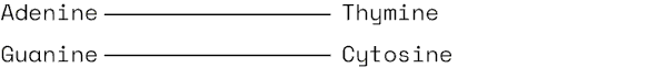
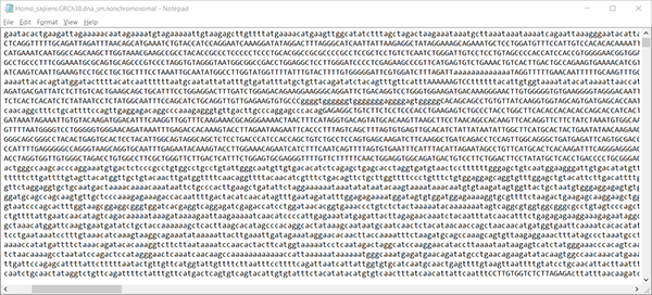
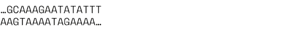
The immediate association with DNA is the iconic spiral ladder, the double helix structure. However, the rungs on that ladder are composed of just 4 nucleotides — or bases — Adenine, Thymine, Cytosine and Guanine. They combine in sequences, somewhat like Morse code.

DNA stores biological data in the form of genes. The genes contain specific instructions needed to create proteins; and the complete set of genes in an organism (called the genome) is like an instruction manual for every single feature of our body.
Each strand of DNA has about 3.2 billion letters of code, and its combination possibilities amount to 10 to the power of 3 billion zeroes. That’s more than there are atoms in a universe.†
†Bryson, Bill. 2003. A Short History of Nearly Everything.


This is the contrast explored in this project. How something that is essentially a series of letters can manifest itself into something so complex, indefinable and multifaceted as life; how our origin and evolution from a cell to human is all a result of encrypted code within DNA.
In a nutshell, how everything we are is a result of different combinations of 4 letters. And if Nature can build all of this beauty and variety around us by communicating through just 4 letters, why can't we?

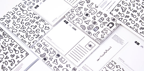
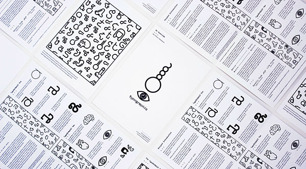
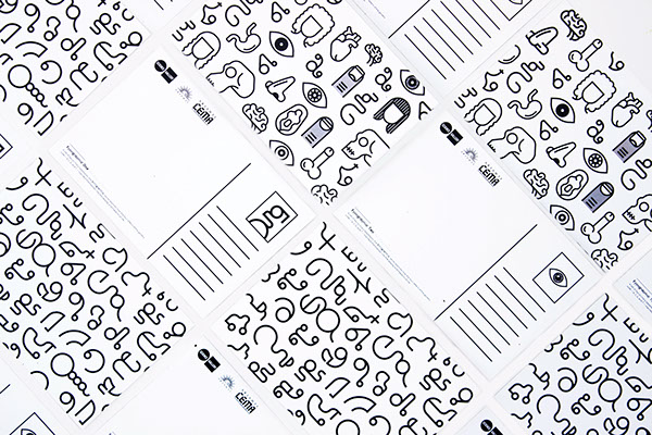
TypoGrAphiC is a set of typefaces that explore and communicate various ideas of the genetic code and its manifestation into human life. It also does this using just 4 letters, the 4 bases in our DNA: A, C, G and T.

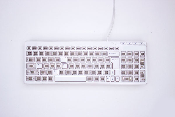

The keyboard I bought and re-purposed to suit the simple needs of TypoGrAphiC


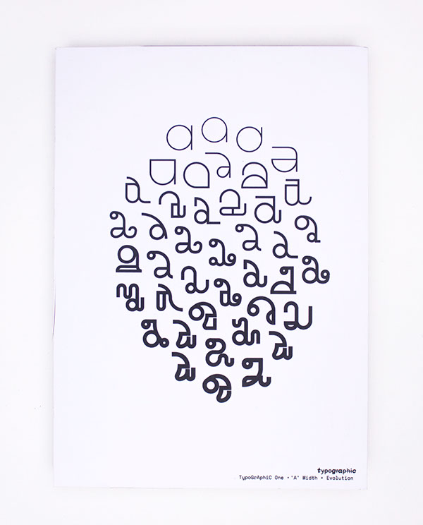
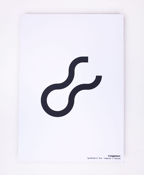
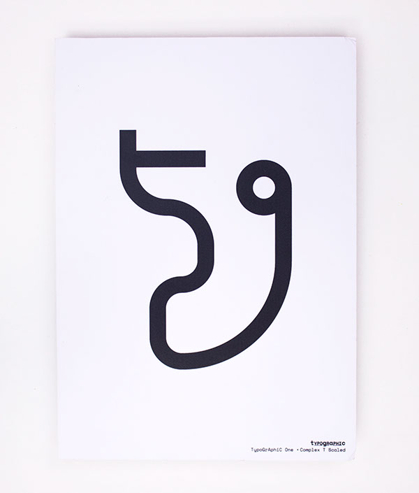
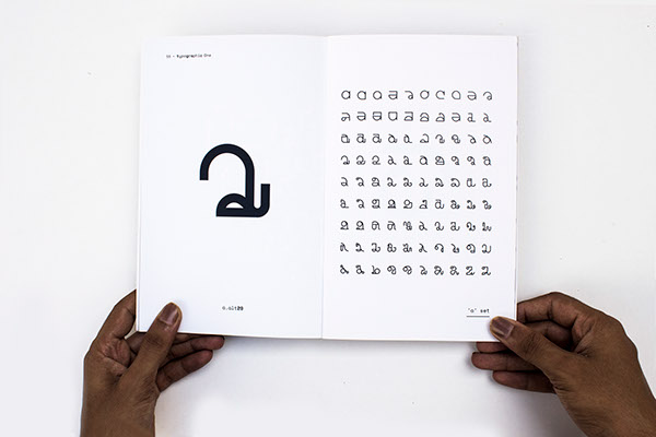
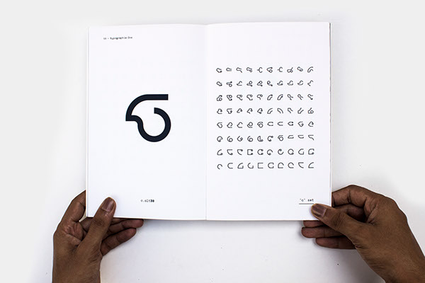
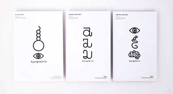
TypoGrAphiC One explores ideas of evolution and mutation through type.
This monospaced, purely geometric font begins in its simplest form, the way DNA existed as the simplest possible organic molecules 3 billion years ago. It attempts to represent this process of evolution and thereafter, the tweaking and mutating that occurred through errors in the genetic code.
Using OpenType substitution features, every time one of the 4 letters is clicked, the glyph mutates, it evolves.

Created based on a simple grid, it embraces its restraints, flourishing and making the most of its limited space. Simple geometric shapes evolve into complex, multifaceted ones, creating a sense of hierarchy through time. The typeface includes 88 variations for 'a', 82 for 'g', 78 for 'c' and 69 variations for 't'.


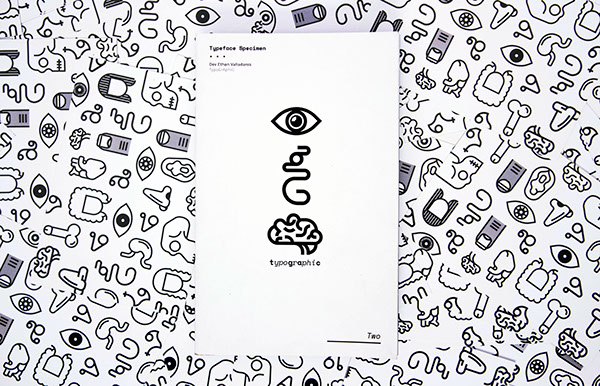
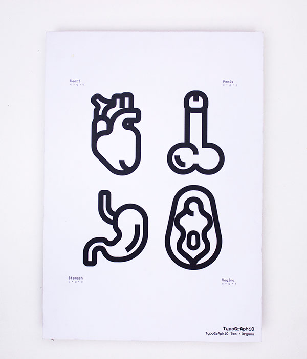
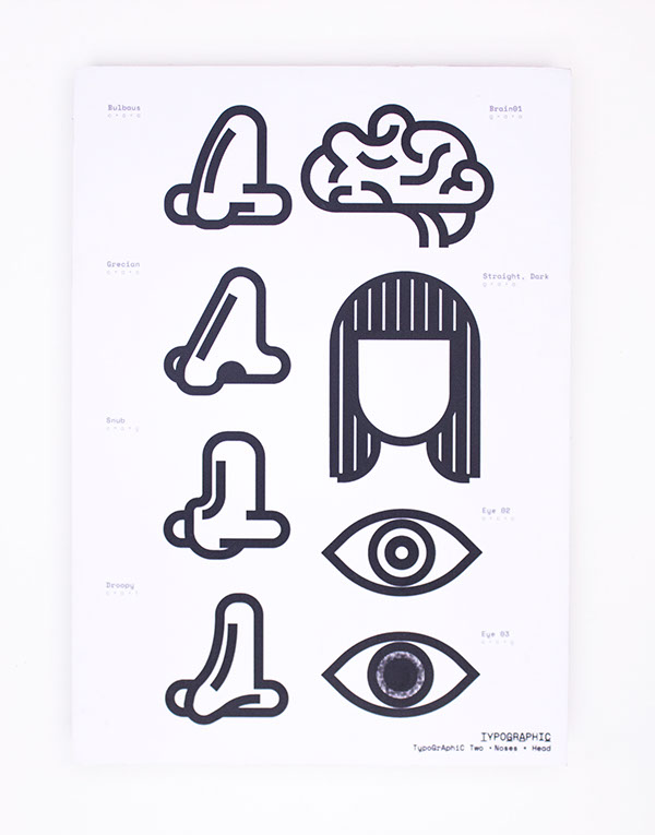
TypoGrAphiC Two represents the genetic code and its direct physical manifestation into everything that a human being is.
DNA is far more important than we give it credit for. Commonly associated primarily with heredity and dominant-recessive traits, we don't realise it plays a part in the creation of every single part of our bodies. From your height and your weight, from the colour of your skin to the size of your feet. For example, in a section of Chromosome 16, it is just these 9 letters that determine the colour of your eyes†.
†Riccardo Sabatini, “How to read the genome and build a human being” (TEDx video), Feb 2016
All of the variety that exists in the world just boiled down to the sequence of just these 4 letters. While definitely not scientifically accurate, TypoGrAphiC Two simplifies the role of the genetic code in determining the variety in the physicality of a human being.


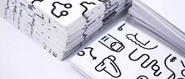
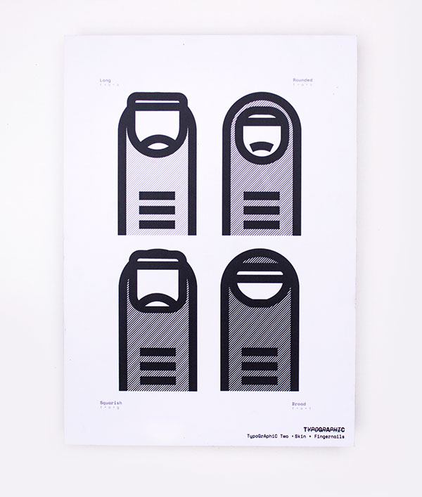
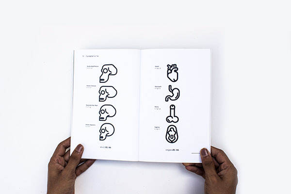
The typeface works on Ligature Substitution: a specific, encoded set of 3 letters (called codons: the ‘words’ that the ‘letters’ a,c,g & t spell) get substituted for a certain physical part of the human body. A slight tweak or modification to those same 3 letters will cause a corresponding change in the same physical part. A range of stand-alone organs have also been illustrated to emphasize the importance of DNA in the life of a human being.

The icons have been constructed using a similar grid to the type, and the visual language remains consistent. It attempts to communicate using 4 letters and 30 icons.


An accidental outcome of this typeface is its tendency to transcend the restraints of readability upon breaking out from the grid, only to form seemingly abstract representations of life and living organisms.


The TypoGrAphiC series is 100% functional! Test it out yourself.

Credit & Acknowledgements • The Living Visual, a course facilitated by Sonalee Mandke, Farhat Ara and Mukund V R • Mohammed Chiba for help with the photography • Music for TypoGrAphiC One & Two: Ant The Symbol - I'm Going To Need To Sleep On It 03 & 04