The Gallery
Category
Region
Country
School
Status
Order by Behance appreciations
Order by Submitted date
 Filter by Portfolio
All entries
Filter by Portfolio
All entries
 Filter by XD
All entries
Filter by XD
All entries
Entries found
Loading entries
Chopsticks
Takeo Hirasawa
York Sheridan Joint Program In Design, Canada
Commercial - Packaging Design
Chopsticks
The nigiri sushi themed Chop Sticks packaging solution is perfect for travel, family gatherings and overall fun. The sushi theme is displayed as a small nigiri icon in the circular logo mark. The PDP is composed of four vertically oriented panels. All sides carry the same body copy (translated in a different language). The four languages (English being the language of international relations, Japanese, Chinese and Korean) prominently share this cultural connection. The package is stainable (constructed with not single a drop of glue), therefore, easily recyclable. The product is convenient, amusing and affordable.
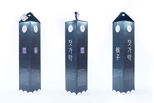
Ease of recyclability was an objective in the development of this concept. All printed packaging components were printed with eco-friendly toner and are assembled with out the use of glue.

It was important that the package graphics resemble the intended
use of the product — to be used to consume sushi and sashimi.
use of the product — to be used to consume sushi and sashimi.


The information panel demonstrates the assembly of a sauce container for the
山葵 (wasabi) and 醤油 (shoyu) sections of a modern typical dining standard.
山葵 (wasabi) and 醤油 (shoyu) sections of a modern typical dining standard.


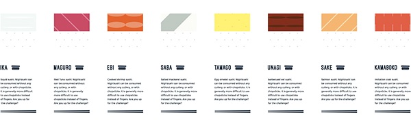

Color, vibrance and tastefulness were important attributes to developing the end solution.


Chopsticks are simple utensils used across various nations. Sushi is a globally recognized cuisine. When sushi and chopsticks are combined together in a designed experience, customer-centric indulgence is enhanced.
