The Gallery
Category
Region
Country
School
Status
Order by Behance appreciations
Order by Submitted date
 Filter by Portfolio
All entries
Filter by Portfolio
All entries
 Filter by XD
All entries
Filter by XD
All entries
Entries found
Loading entries
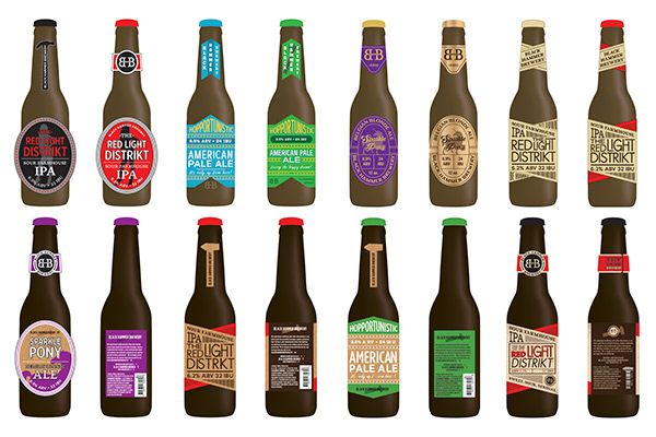
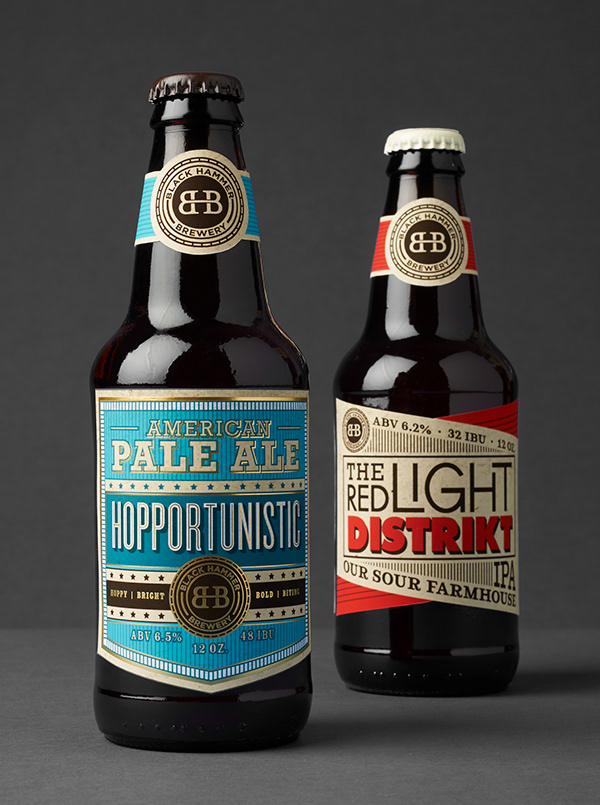
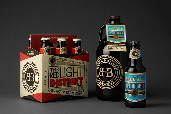
Black Hammer Brewery
Celina Oh
Academy of Art University, United States
Commercial - Packaging Design
Category Semifinalist
A packaging design and identity for a local brewery in San Francisco called Black Hammer Brewery, the home of Burners. This was done in one month's time during a summer class in 2017 at the Academy of Art University.
OBJECTIVE
Create a packaging identity for a local brewery in four weeks. Black Hammer Brewery is owned and operated by “Burners”, or those who go to Burning Man, a movement/event based on principles such as Self-Expression, Communal Effort, and Leaving No Trace. Burning Man is best known as an energetic, creative event where artists build radical art installations and display their steampunk, eclectic fashion.
APPROACH
Hopportunistic's label conveys a sense of the American Dream. Heavy type, subtle stars and stripes, accents of gold foil, and a shield-shaped label combine to project patriotism and opportunism. The Red Light Distrikt beer label took typographic and color inspiration from the signs one would see in a Red Light District. The “k” in the name taken from the music and art collective/non-profit at Burning Man known as the Distrikt. Chunky, funky, and dirty, this sour farmhouse IPA is like no other.