The Gallery
Category
Region
Country
School
Status
Order by Behance appreciations
Order by Submitted date
 Filter by Portfolio
All entries
Filter by Portfolio
All entries
 Filter by XD
All entries
Filter by XD
All entries
Entries found
Loading entries
Land Matrix
Juliette Wang
Maryland Institute College of Art, United States
Commercial - Print / Graphic / Illustration
Category Semifinalist
A modern phone case brand that values aesthetics and simplistic design but still embraces the mixture of gradients and geometry into the distorted world of glitches. Entire project created from scratch from the development of the physical phone cases to creating the brand language to producing the user interface elements.
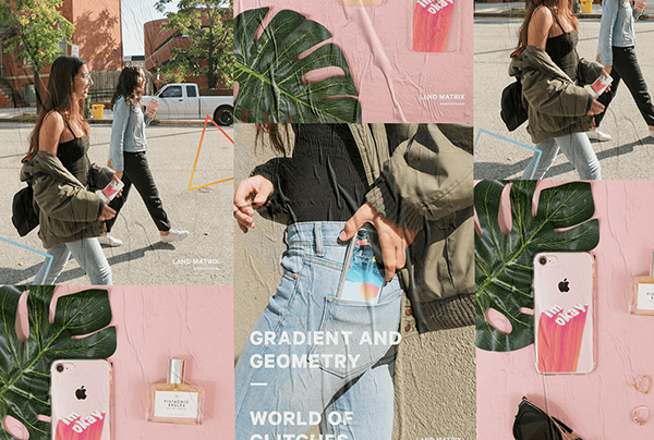
Land Matrix is a modern phone case brand that values aesthetics and simplistic design but still embraces the mixture of gradients and geometry into the distorted world of glitches. This a complete project created from scratch, from the development of the physical phone cases to creating the brand language to producing the user interface elements. As a brand that differentiates from others through distinct aesthetics and love for unique, futuristic graphics, I created a brand visual that stays minimal to showcase its phone case to their potential. The name stemmed from the core of Land Matrix’s graphics, where inspirations were taken from the world around me and the graphics forms and glitches from the landscapes.

I kept the logo simple through a clean sans serif to not overpower the cases itself. However, I wanted to bring the core elements of the brand into the these tags; through utilizing the brand’s geometry and gradient, I created these shapes that goes on to morphing itself into the brand.
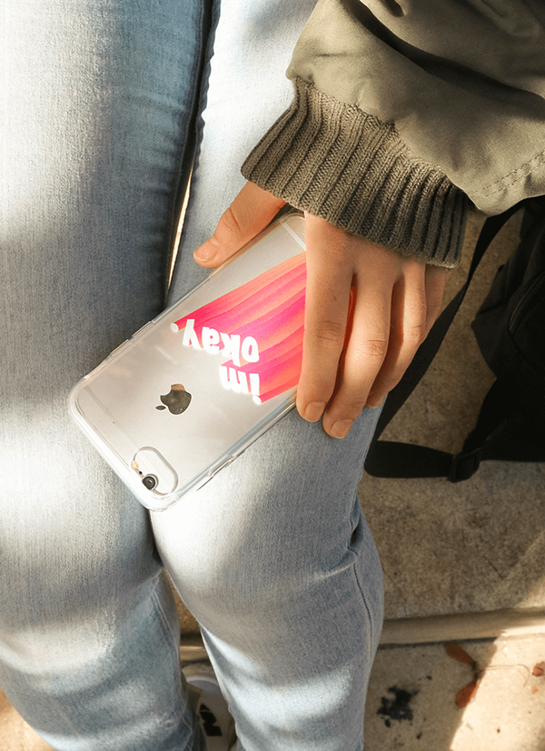


The phone case graphics are where I had the most fun experimenting and playing with different effects and graphic elements. Getting inspired by gradients and geometric lines, I integrated them with photos I took myself. This is where being inspired by the world comes in and allows me to play with graphics and experiment with the transparency of the phone cases.
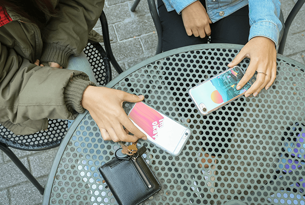
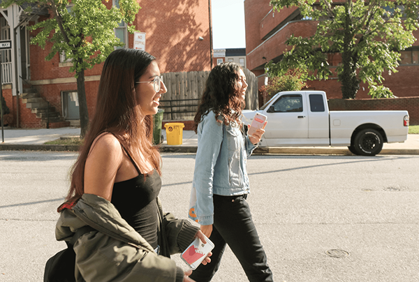
After creating the graphics, I sent them out to be printed on the phone cases and then brought them out to be documented with the brand’s aesthetic. I took both product shots and lifestyle shots in order to set the mood for Land Matrix. To spice up the visuals of the product shots, I brought in other items that would make sense placed around the phone and set them on a colored background. This was also where one of the core brand color light pink comes in, which is later used on the website and other media.
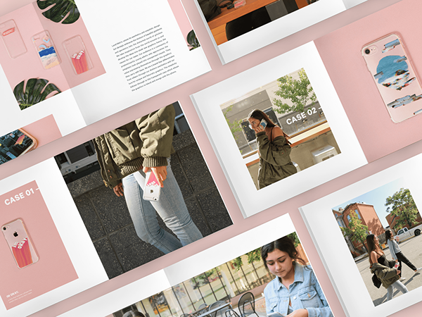
I decided on a wheat paste poster campaign on top of instagram socials because it is a starting business and the posters would be fast and easy to reproduce in multiple locations. The idea was to have it repeated as a collage grid where it could cover a large wall. Keeping the graphics simple allowing the photography to speak for itself, I created a brand language of bold sans serif text as visual elements and minimal graphics. Instead, I created a rhythm through the cropping and placement of images within an underlying grid for the lookbook.


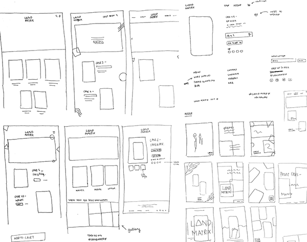
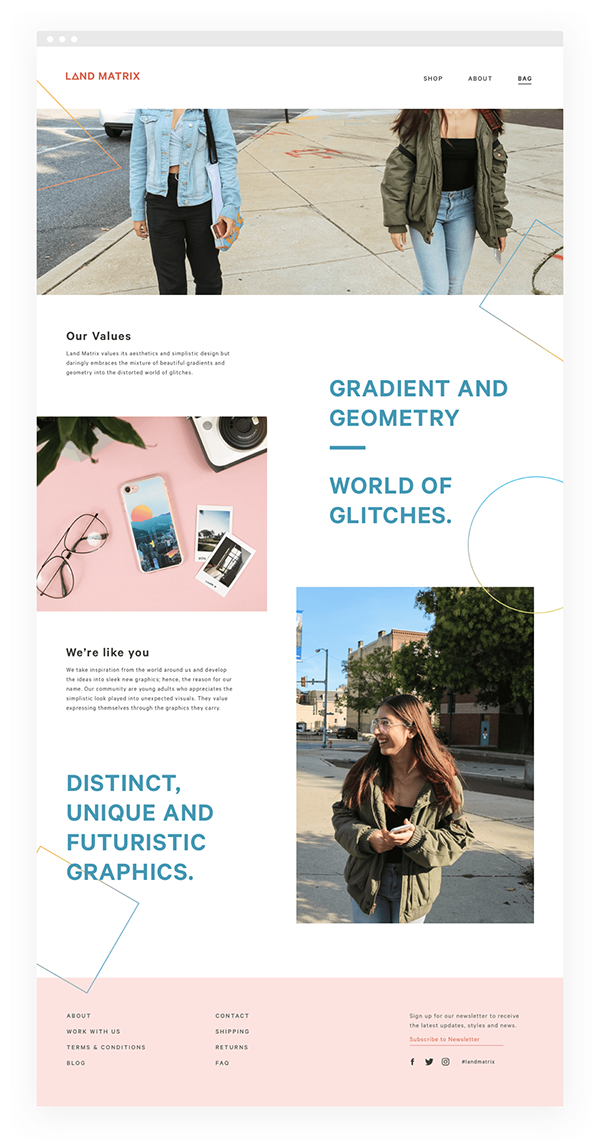
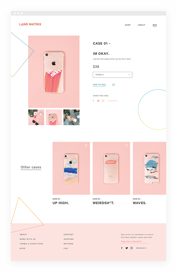
The website reflect the aesthetics and beliefs of Land Matrix, creating a simple clean interface, incorporating the geometry whilst letting the phone cases be the focus through the photography. Bringing in the same larger bold typography into the about page makes the information displayed much more friendly and exciting.
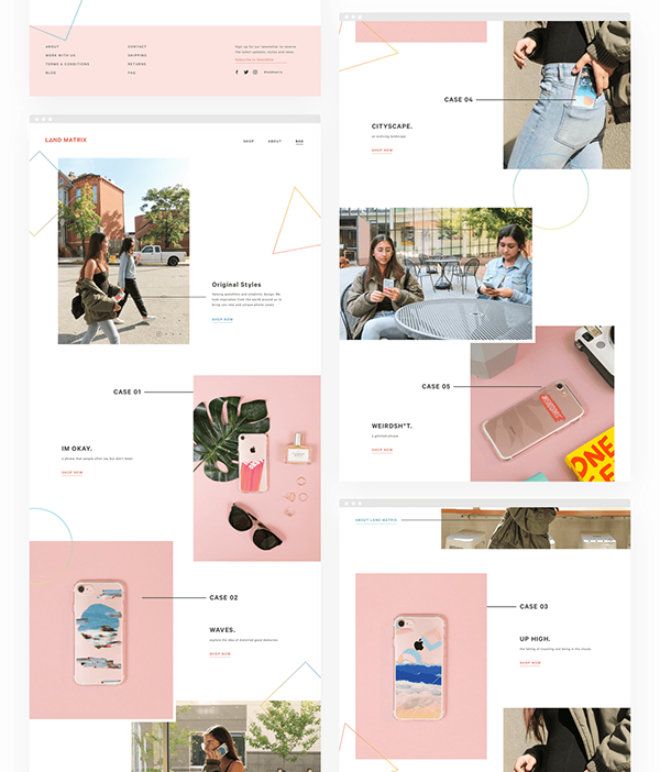
Then developing the mobile concepts by customizing it and making sure all the elements translates well on a smaller screen. The interactive experience is to have the geometric shapes float as user swipes and scrolls down the page.

Thanks for Viewing!