The Gallery
Category
Region
Country
School
Status
Order by Behance appreciations
Order by Submitted date
 Filter by Portfolio
All entries
Filter by Portfolio
All entries
 Filter by XD
All entries
Filter by XD
All entries
Entries found
Loading entries
Taipei Olympics 2020
Juliette Wang
Maryland Institute College of Art, United States
Commercial - Print / Graphic / Illustration
Category Semifinalist
A branding project for the Olympics Games, the print collateral revolves around the logo identity representing the Chinese character “灣” as well as depicting an abstracted graphics of water, sports and track and field.
Taipei Olympics 2020 is a branding project for the Olympics Games, the print collateral revolves around the logo identity representing the Chinese character “灣” as well as depicting an abstracted graphics of water, sports and track and field. Utilizing and repurposing the graphic elements into patterns that makes up the various print materials for Olympics.

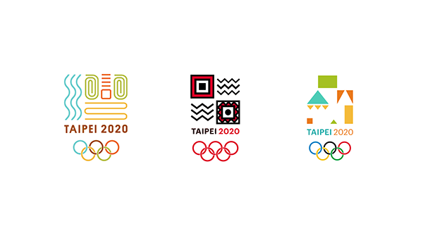
As previously mentioned, the Chinese character “灣” is made up of water on the left, track and field and a ball abstracted. Taipei 2020 is written beneath with the olympic rings to follow the logo tradition throughout the years. The colors of the Olympic logo is changed to match the brand colors. Below are other logo ideas inspired by the taiwanese indigenous groups' patterns and fabric also abstracted into the logo.


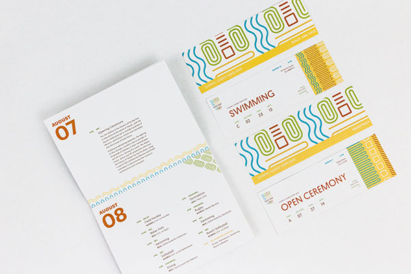
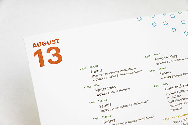
The tickets follow the similar clean aesthetic, with the seating clearly visible and the secondary elements smaller right aligned. All the text of the print collateral follows the same brand colors with the brown replacing black text. Behind the tickets features the logo enlarged and a yellow bar hi-lighting the event name.


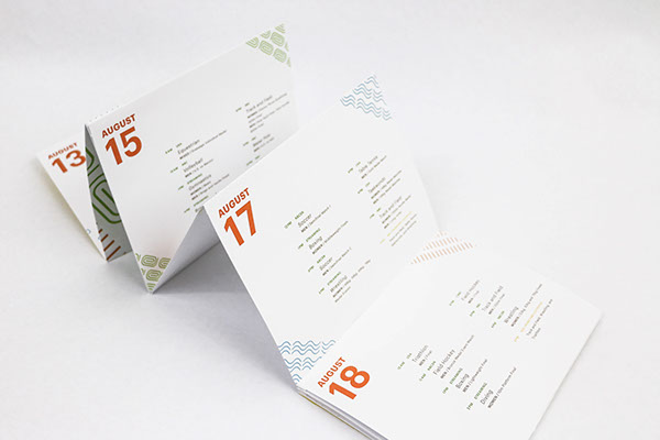
The schedule is in an accordion form to offer an unique and fun experience for the event attendee to either flip through or look at it as a long flat form to see all the different days. The booklet starts with an introduction and a map of the main games area with the gates clearly marked. Then each day is on a separate page with the times and event clearly written to allow easy to follow guidance.


The website also utilizes the elements sprinkled throughout the homepage, creating a clean and easy to navigate homepage that introduces several sports and programs to direct the user through the website. I enjoyed intertwining the elements in with the images and allowed text to flow alongside – the elements in turn allows the audience to be guided through the page.


Thanks for Viewing!