The Gallery
Moondust
Joel Isimeme
Liberty University, United States
Commercial - Print / Graphic / Illustration
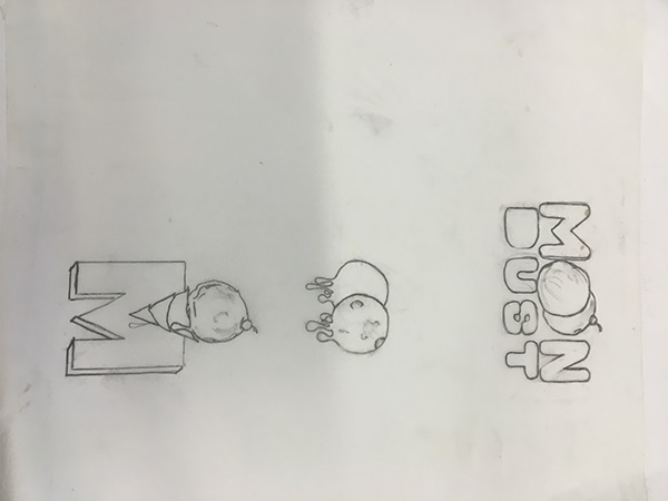
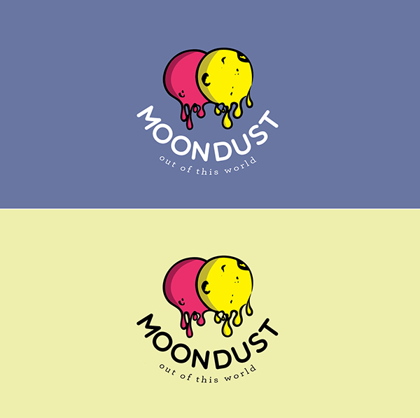
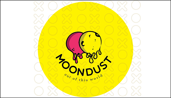
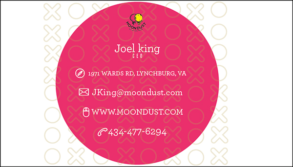
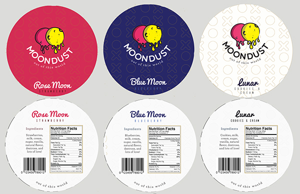
Song title- Moondust Artist – Jaymes Young Company- Moondust Icecream Lyrics I'm building this house, on the moon Like a lost, astronaut Lookin at you, like a star From the place, the world forgot And there's nothing, that I can do Except bury my love for you The brightness of the sun, will give me just enough To bury my love, in the Moondust I long to hear your voice, but still I make the choice To bury my love, in the moondust Nothing can breath, in the space Colder than, the darkest sea I have dreams about the days, driving through your sunset breeze But the first thing I will do Is bury my love for you The brightness of the sun, will give me just enough To bury my love, in the Moondust I long to hear your voice, but still I make the choice To bury my love, in the moondust I'm a cast away, and men reap what they sow And I say what I know, to be true Yeah I'm living far away, on the face of the moon I've buried my love to give the world to you The brightness of the sun, will give me just enough To bury my love, in the Moondust I long to hear your voice, but still I make the choice To bury my love, in the moondust I've buried my love, in the Moondust Rationale: The idea behind the whole company was the the theme of the song which is basically heartbreak or letting someone go. The first thought that came to mind was Wine but then I thought what’s better than wine for heartbreak? and Is for everyone? ICE CREAM! Heartbreak isn’t just for relationships, but for everyone that has ever lost someone they loved. So the idea behind the whole design was something that made someone feel better, so I went with brighter color, more cheerful colors for the logo. The logo shows two moons melting symbolizing the ice cream feature and how that all good things fade away but don’t forget about the good times that they brought. There would be two type of ice cream, the regular all season ice cream that was in the regular ice cream casing. The other would be the seasonal flavor line that was in shape of a moon symbolizing the different type of full moon that came every month like May- Flower moon etc. The moon would be pretty see through but not all the way. The moon ice cream has a slot so that it also double as a DIY project that you could hang from the top and hang from the ceiling, you would put a candle in it and it would double as a heavenly body (star) “Like a lost, astronaut looking at you, like a star…” like in the lyrics.